WEB
Development
Marketing Services
Graphic Design
Packages
Unified Web Services logo - Affordable website design agency in Essex, London
Start Your Project

Project Overview

The SHA Fitness branding project focused on creating a logo that stands as the visual foundation brand. The main logo uses bold Ethnocentric font and strong design to show power and energy. Submark logo was also made to work well on websites, social media, and physical products.

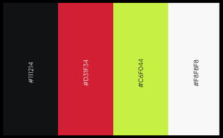
The colour palette combination of red and black expresses passion, power, and resilience, perfectly capturing the essence of the SHA Fitness mission.

Each logo version, from the flowing “S” to the human figure and “F” symbol, shows movement, growth, and strength. These elements work together to show SHA Fitness’s commitment to helping people reach long-term fitness and confidence.

Client : SHA Fitness
Duration: 2 Weeks
Project Type: Logo Design
Location: United Kingdom

Logo Metaphor

The flowing “S” shape reflects SHA Fitness brand name, symbolising strength, motion, and continuous progress.
The icon cleverly combines an “F” symbol with a person, representing fitness, individual transformation, and personal empowerment.
The integration of the dynamic “S” and the personified “F” results in a bold identity that represents SHA Fitness’ journey of strength and continuous growth.

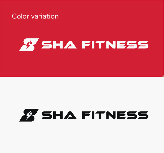
Logo Variation

Primary
Logo
This primary logo represents the complete brand essence and fundamental values of SHA Fitness.
Submark
Logo
A compact icon from the primary logo, ideal for profile pictures, watermarks, and minimalist branding.
Vertical Logo
Horizontal Logo
Combined logo - With its striking Ethnocentric design, the primary logo captures the strength, motivation, and dynamic spirit of SHA Fitness.
Typeface, Ethnocentric is a sharp, bold display font built for maximum legibility and visual strength. As distinctive lettering improves brand recall, it gives SHA Fitness a strong, unmistakable identity.

The Challenge

SHA Fitness, a trusted personal training service based in Chigwell, needed a logo that would resonate with clients and reflect its core values of strength, transformation, and personalised fitness guidance. The challenge was to create a distinctive logo that captures the brand’s commitment to empowering individuals on their unique health and fitness journeys.

Our
Approach

To create a logo that truly reflects SHA Fitness's innovative spirit, we followed a focused and collaborative design process aligned with their AI-driven vision:
1

Brand Analysis:

  • Explored fitness industry trends and competitors to ensure a unique and compelling visual identity.
  • Clarified SHA Fitness's brand message: empowering individuals to take control of their health through personalised fitness coaching.
2

Conceptualisation:

  • Focused on dynamic shapes to express energy and transformation.
  • Combined the “F” with a human silhouette for personal empowerment and used a flowing “S” to represent strength and progress.
3

Typography and Font Selection:

  • Opted for the sleek, modern Ethnocentric typeface to reflect a sense of power and modernity.
  • Customised letter spacing to enhance visual impact and maintain legibility across all formats.
4

Color Palette Development:

  • Developed a vibrant palette combining intense reds with deep blacks to capture motivation and resilience.
  • Carefully balanced hues to ensure consistency and strong presence in all brand materials
5

Iteration and Feedback:

  • Shared several logo concepts and integrated client input throughout the process.
  • Tested the logo in various sizes and applications to ensure consistency and impact.

The Impactful Outcome

The final SHA Fitness logo successfully blends strength, energy, and approachability with a flowing “S” and an integrated “F” with a subtle human figure. Paired with the bold Ethnocentric font, the design reflects a modern and empowering fitness spirit.

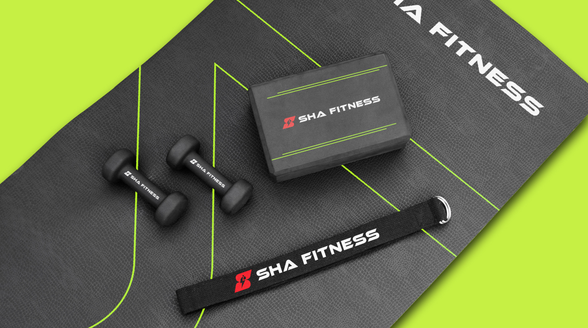
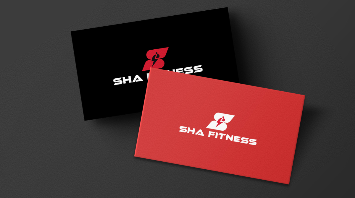
The versatile logo variations provide flexibility for use across a wide range of applications, from digital platforms to physical branding. This thoughtful design strategy has elevated SHA Fitness's visibility and professionalism.

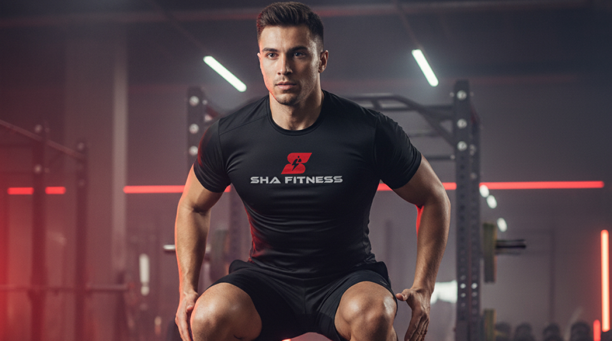
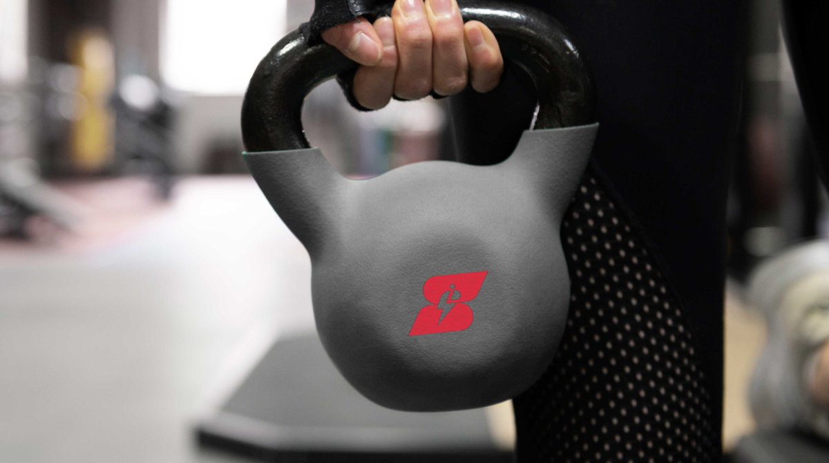
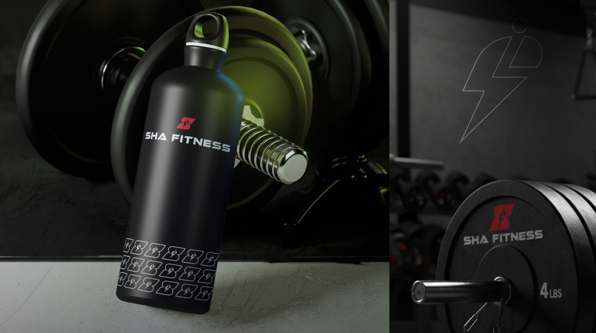
Visual results of Mockups

WHERE MIND AND BODY EVOLVE TOGETHER

A
Sharathpriyan Surendranath
CEO / ShaFitness
Unified Web Services did a fantastic job redesigning our website and moving it from Wix. They also manage our social media and improved our SEO, which has really helped increase our brand recognition and sales. We are very happy with the results and definitely recommend their services!

The Result That Made the Client Happy

Next Project
Click Here
© 2025 Unified Web Services. All rights reserved.
cross-circle
FREE SEO AUDIT
unifiedwebservices.co.uk
Privacy Overview

This website uses cookies so that we can provide you with the best user experience possible. Cookie information is stored in your browser and performs functions such as recognising you when you return to our website and helping our team to understand which sections of the website you find most interesting and useful.