WEB
Development
Marketing Services
Graphic Design
Packages
Unified Web Services logo - Affordable website design agency in Essex, London
Start Your Project

Project Overview

The Benjamin Pharmacy logo was designed to reflect a trusted and caring pharmacy that has been part of the Chingford community for over 50 years.

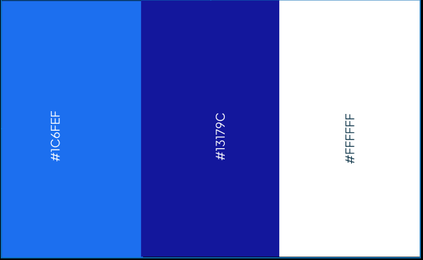
The royal blue and sky blue colours represent trust, health, and calmness, showing patients they are in safe hands. The modern, clean font makes the logo approachable while keeping it professional and memorable.

The design is simple, strong, and versatile, looking great across the pharmacy’s signage, website, and printed materials. It communicates Benjamin Pharmacy’s dedication to expert care, personal service, and supporting local families every day.

Client : Benjamin Pharmacy
Duration: 2 Weeks
Project Type: Logo Design
Location: United Kingdom

Logo Metaphor

The Letter “B”: Representing the first letter of Benjamin, the bold and clean “B” reflects the pharmacy’s strong identity and reliability.
The “+” Symbol: The plus sign is a universal mark of healthcare and wellbeing, highlighting Benjamin Pharmacy’s focus on patient care and support.
The Combination: Placing the plus sign at the heart of the “B” creates a distinctive and memorable symbol that embodies trust, care, and the pharmacy’s commitment to the community.

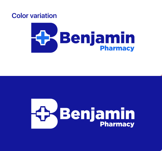
Logo Variation

Primary
Logo
The main logo shows the full identity of Benjamin Pharmacy, reflecting trust, care, and its long history in Chingford.
Secondary
Logo
A smaller version of the main logo for use in tight spaces, keeping the brand clear and recognisable.
Submark
Logo
A minimalist version of the logo, perfect for social media, app icons, and small branding needs.
Vertical Logo
Horizontal Logo
Wordmark: The Benjamin Pharmacy logo is designed in Gotham Black, giving it a bold and confident look that reflects the brand’s professionalism and trustworthy identity.
Typeface: Gotham Black is a modern typeface with strong, bold letterforms designed to enhance clarity and readability. Gotham ensures the brand communicates professionalism and trust with every word.

The Challenge

Benjamin Pharmacy, a trusted family-run pharmacy in Chingford for over 50 years, needed a logo that would instantly convey its values of trust, care, and professional expertise. The challenge was to create a design that felt approachable and welcoming while reflecting the pharmacy’s dedication to personalised healthcare and standing out in the local community.

Our
Approach

To design a logo that truly reflects Benjamin Pharmacy’s brand and values, we followed a careful and thoughtful design process.
1

Brand Analysis:

  • Studied the local healthcare landscape to create a logo that conveys reliability, care, and connection with the Chingford community.
  • Clarified the brand’s essence: providing friendly, expert healthcare that patients can trust.
2

Conceptualisation:

  • Incorporated the “+” symbol within the “B” to represent health, support, and personalised service.
  • Designed a bold, modern Gotham Black typography that enhances readability, and brand recognition.
3

Typography Selection:

  • Selected a clean, modern sans-serif font to convey clarity, approachability, and professionalism.
  • Ensured spacing and proportions create a balanced look that works across both print and digital platforms.
4

Color Palette Development:

  • Selected royal blue and sky blue to convey trust, care, and a sense of calm.
  • Applied subtle shading to add dimension and make the logo feel modern and approachable.
5

Iterative Design and Feedback:

  • Developed several logo concepts and refined them through feedback from Benjamin Pharmacy.
  • Adjusted details to ensure the logo works perfectly across signage, website, and other digital or print materials while maintaining a consistent and polished look.

Impactful Outcome

The final Benjamin Pharmacy logo combines trust, care, and approachability, creating a distinctive and memorable brand identity in the Chingford community.

The clean typography and harmonious royal blue and sky blue palette make the logo instantly recognisable while reflecting the pharmacy’s dedication to professional and friendly healthcare.

The versatile logo variations ensure it performs well across digital platforms, in-store signage, and printed materials. This thoughtful design has strengthened Benjamin Pharmacy’s presence, helping patients immediately associate the brand with expert care and a welcoming, community-focused experience.

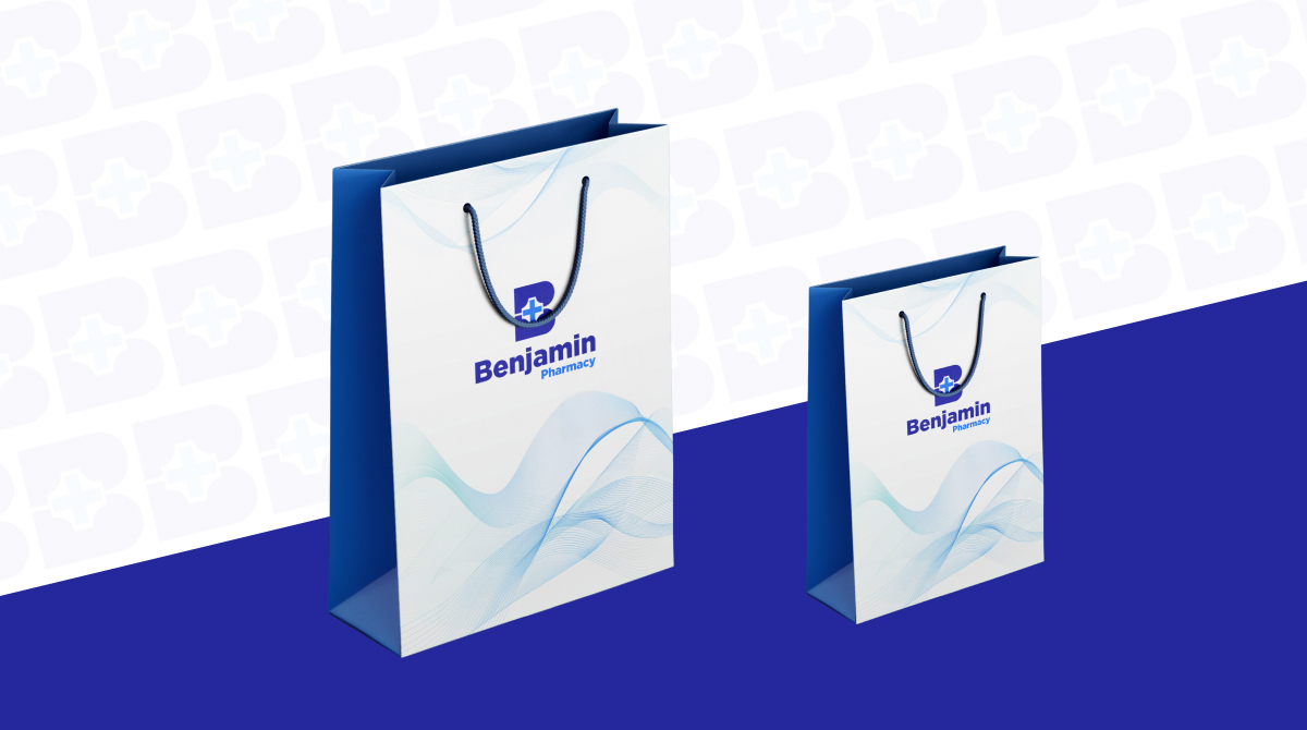
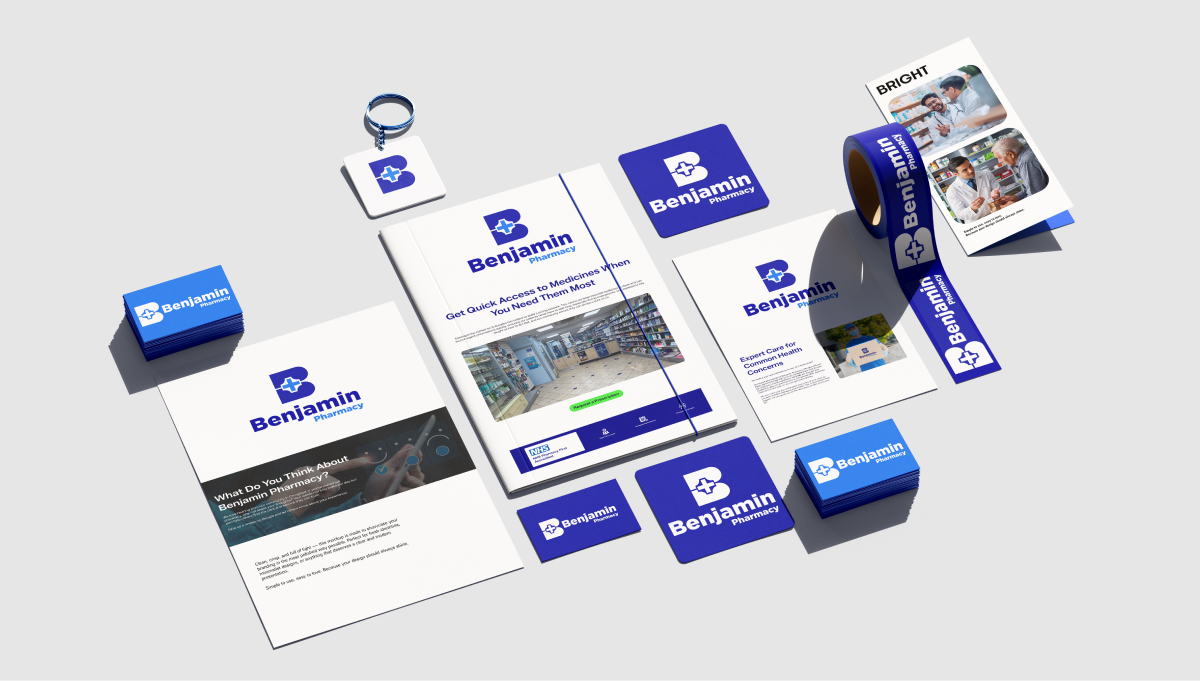
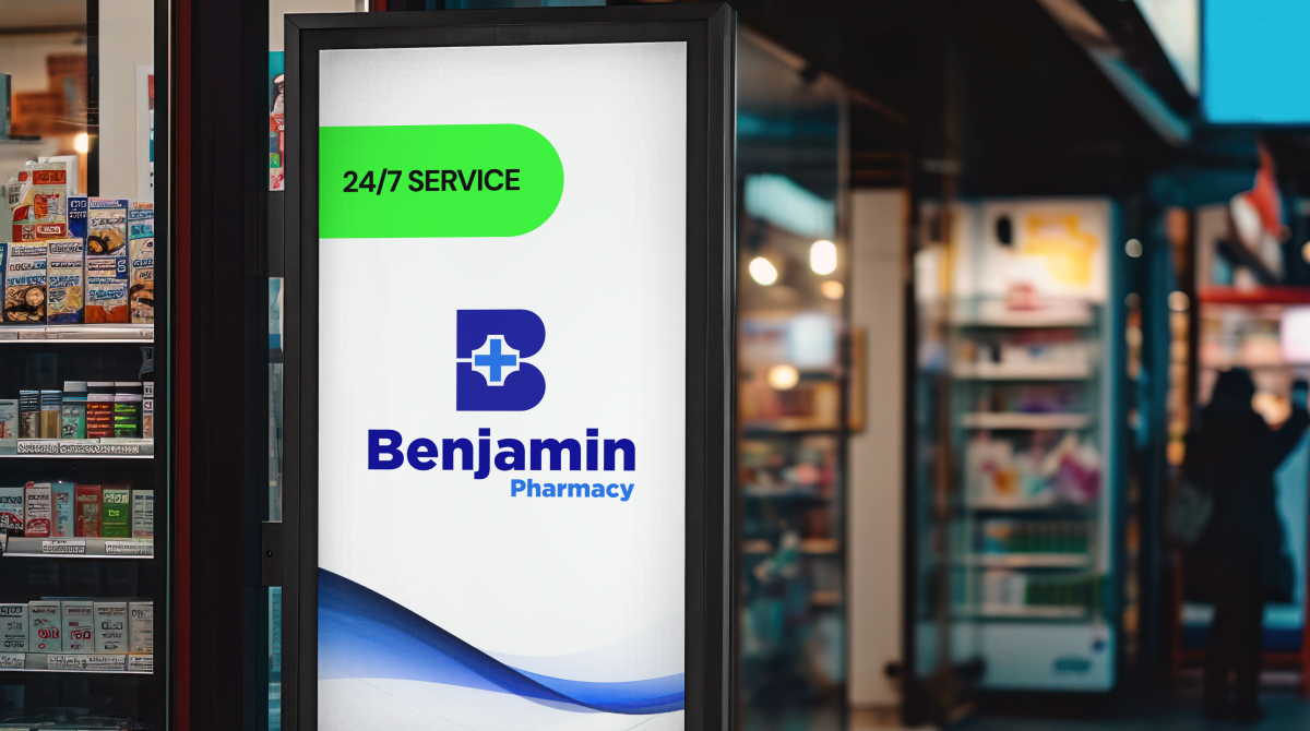
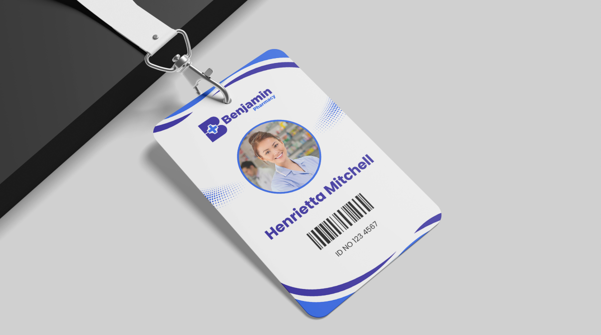
Visual results of Mockups

THE BENJAMIN PHARMACY THE BENJAMIN PHARMACY

A
Sharathpriyan Surendranath
CEO / ShaFitness
Unified Web Services did a fantastic job redesigning our website and moving it from Wix. They also manage our social media and improved our SEO, which has really helped increase our brand recognition and sales. We are very happy with the results and definitely recommend their services!

The Result That Made the Client Happy

Next Project
Click Here

Essex-based Digital Marketing Agency providing services like SEO, Content Marketing, Social Media Management, Web Design & Development, Video Editing, Branding, UI/UX & Email Marketing

© 2025 Unified Web Services. All rights reserved.
cross-circle
FREE SEO AUDIT
unifiedwebservices.co.uk
Privacy Overview

This website uses cookies so that we can provide you with the best user experience possible. Cookie information is stored in your browser and performs functions such as recognising you when you return to our website and helping our team to understand which sections of the website you find most interesting and useful.